
TL;DR
It’s 2020 (and was 2019 at the time of this incident; however, I’m 100% certain the doors have not been replaced). Why are we still doing this? It’s been dead.
Quick Intro
Often times, when we need to walk in and out of buildings or rooms, we use doors. Right? It’s been this way for quite a while. So, I think we can all agree that this is not a new concept.
To set the scene: I’d just finished a meal at a restaurant and proceeded to leave.
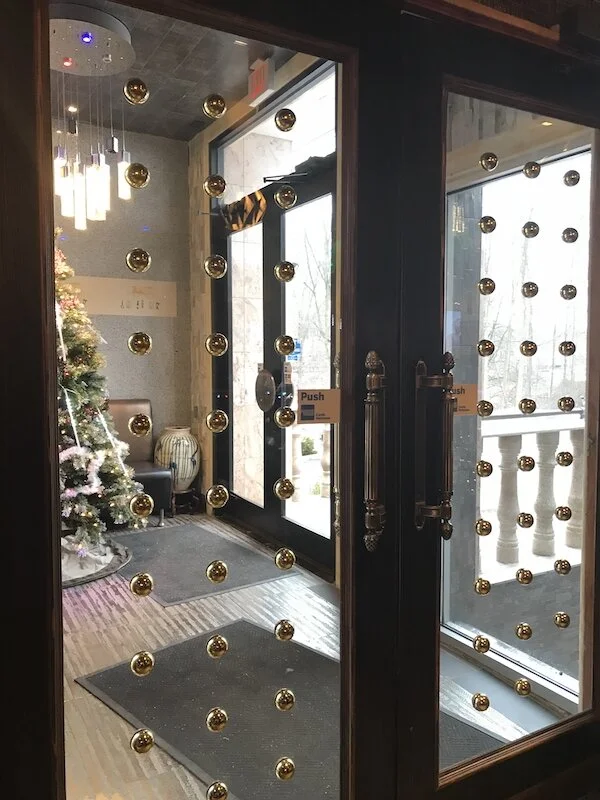
Picture of two double doors leading out of a restaurant.
My Goal
I just wanted to simply open the door and be on my way.
GIF of Viserys from Game of Thrones saying “That was all I wanted.” (credit: deviantart.com)
My Experience
As I walked up to the door, I could see the sign that read “push.” Meanwhile, there were also two very obvious signs that didn’t need words — the door handles. I’m sure I can safely say these handles mean “pull” to most of the American population (at the very least).
The result: a momentary mental conflict and strong feelings of annoyance that handles made to be pulled still exist on doors that are meant to be pushed.
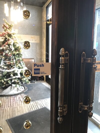
Picture of double doors that have vertical handles with a sticker sign nearby that says “push.”
Dope or Dead?
I’m keeping this short because it’s been beyond dead to me for some time now. The only reason I didn’t have too much trouble (i.e., I didn’t try to pull on the handles) with this particular door was because of the extra signage; however, I can’t begin to count the number of times I’ve pulled on a door that could only be pushed, even with a sign present!
Whenever this happens, it’s irritating and sometimes a little embarrassing depending on the situation. Making users feel silly for using a design the way it signifies it is to be used is not an end goal that I believe any designer should aim for; it makes for poor UX.
Man opening and then beating up a door, ripping it to shreds. (credit: giphy.com)
UX Corner
In UX, there are things called signifiers and affordances. A signifier describes or illustrates what something can do while an affordance is essentially a big-picture view of what that object does (which is many times based on user interpretation and ability). In this case, the door described in this anecdote is an affordance. From what I understand about doors in general, this door should allow me to pass through to enter or exit the building. Since the door is closed, I can’t really tell which way it opens; however, I do know from previous experience that it does open.
The handle (i.e., a signifier) juts outward and I, as a user, am able to reach out and interact with it. My interpretation of how to interact with the handle, I’m sure, stems from many previous interactions with doors with similar handles that are able to be pulled open. From my perspective, it only makes sense to interact with the door in this way. However, the “push” sign (i.e., another signifier), lets me know that the interaction I had in mind is actually not the way the door is meant to be used. Clearly, the two signifiers are at odds with each other since they communicate that two opposing interactions are possible with this door (which, in reality, is false).
Good UX requires designers to understand what affordances and signifiers are in order to use them in ways that are most helpful for users. It’s important that they complement one another, helping to provide a more complete understanding of how different objects or products are to be used. Anything less, especially if they’re at odds, is sure to cause unnecessary friction.
Are there instances in which opposing affordances and/or signifiers are helpful that you can think of? Let me know in the comments.