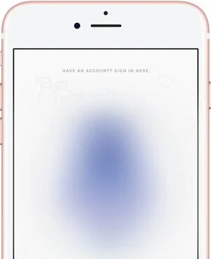
About Product X:
Product X is an iOS app that helps beauty consumers find hair products that will most likely work well for them. With the help of this expert system, consumers answer 4 questions via chat and are able to scan or search for hair products to receive personalized predictions (known as match scores) on their performance.
Background:
After creating wireframes for update 0.2, I needed to validate that what I designed was easily usable and understandable to individuals outside of my team. Vector90, a co-working space in South Los Angeles, was hosting an event known as The Burnout. At this event, multiple people from the surrounding area gather in one place to get work done for about 8-12 hours straight. I chose to attend because I saw this an opportunity to use the venue and event to conduct user testing sessions. This fit perfectly into our already limited budget.
At the event, I set up a small testing area and invited individuals (most of whom were at least partially in our target market) to participate in exchange for a gift card. This page will focus on the process of getting feedback on the wireframe designs.
To learn more about the process of designing the wireframes that were tested, please click here.

The Project Details
Timeline: ~10 weeks (3-4 sprints); (testing and analysis specifically: 1 week)
Team: The Company X team consisted of a remote team of 3 people: myself, 1 in San Diego, CA, and 1 in Michigan. I worked closest with the Founder/CEO and the CTO/Head Developer
My Role: Director of UX (User Research, User Testing, UX Design)
Tools Used: Sketch, Marvel App, Google Slides
Objective:
In order to get actionable and usable feedback on the wireframes, I needed to ensure that each test I performed was consistent for all participants. I took the following approach:
Use test script consisting of an introduction to the product/company, warm-up interview questions, wireframe tasks, and concluding questions
Have participants test on their own devices
In addition to the wireframes, we also needed feedback on new copy we were considering for the onboarding chat in the app.
The goals for testing were as follows:
Observe if users could easily interact with new chat layout
Test if users could easily (and more accurately) select their hair texture type
Assess how users felt about the chat and the questions asked
Observe if users understood and could easily progress through the onboarding calibration
Observe if users understood the recommendations and regimens
Assess how users felt about the new chat copy
User Testing:
Courtesy of Vector90.com.
In total, I tested with 6 participants (with the first as a test run). Each testing session lasted around 25 minutes and those who stated that they could contribute more time to review the chat copy tested for an additional 5 minutes.
Prior to testing, I created a wireframe prototype (using Sketch) which I prepared in the Marvel App. I also created 3 scenarios for different testers to read and refer to while testing so that different participants experienced selecting different answers during the chat. What I was most interested in was their interaction when choosing 1 vs multiple textures. I also aimed to assess whether or not the questions asked in the chat were easy to understand.
Additionally, in order to get feedback on the new chat copy, I typed out the conversation flow that the team agreed needed the most attention. This portion of the testing was optional and left up to the tester’s discretion since the copy was not prioritized ahead of getting feedback on the wireframes.
After each test, the participants were awarded with a $10 gift card and were required to sign a receipt to indicate they’d received compensation. On this receipt, I added a small questionnaire in order to (1) receive permission to contact them in the future and, (2) assess their personal interest in the app.
Guerilla Testing
In addition to the testing done at Vector90, I performed a round of guerrilla testing sessions at a local Starbucks in order to get feedback on the chat copy from women who appeared to be of different ethnicities and ages.
I chose to get feedback outside of the testing event in order to ensure that I had input from participants that had a different background. We wanted the chat conversation to be natural, engaging, and friendly for all — getting the copy in front of as many different sets of eyes helped to increase our confidence that Product X’s language could be understandable and fun to different people.
Major Findings:
Ingredients Preference Answers
During the first 2 sessions of testing, participants had trouble understanding how to answer the 4th question on ingredients preference. Originally, it was wireframed to reflect the structure it already had in version 0.1.5 — where the terms were defined in the chat.
The explanations for Ingredient Investigator and Performance Perfectionist existed in the chat message from Product X.
I observed a participant attempt to select the chat bubble that contained the description instead of the actual answer option. This prompted me to update the wireframe to the following design:
After this update, each subsequent tester answered the question successfully, with ease.
Chat Answers
Because the prototype being tested was with static wireframe designs, many testers needed a few seconds to acclimate to the chat screens. Once testers realized that the screens were designed to appear as though they were looking at a chat, their interaction with the up and down arrows came much more naturally.
Some testers attempted to swipe up to reveal the answer options while others only tapped the up arrows (some testers alternated between both types of interactions throughout the test). After observing this, I determined that the entire answer field needed to be interactive and not just the up button or answer prompt.
After iterating (i.e., designing the prototype to recognize any interaction in the answer field), interacting with the chat became much easier.
Texture Type Selection
All testers were able to easily find and select a texture type without suffering from the confusion that plagued users once before when the answer options were not images.
In the tested prototype, only 4 texture images were present and participants were given tasks that prompted them to select what they believed represented a specific texture (e.g., in one scenario, participants were told that they had “coily” hair while in another scenario, participants were told they had “straight” hair).
Each participant was also asked if any of the photo images closely represented their actual texture, and if so, to point them out. The majority of participants were able to select the image that was most accurate, leading me to feel comfortable with continuing the images over terms approach.
Onboarding Calibration
All participants progressed through the calibration portion of the onboarding process easily, without issue.
Recommendations and Regimens
The majority of participants understood the purpose of the recommendations/regimen screen and stated similar things when asked what they’d expect to see after selecting “Learn More.”
Conversation Copy
The copy was described as fun, easy to understand, and/or friendly by all testers.
Lessons Learned:
Public events can be a great resource to take advantage of to get feedback with minimal recruitment effort, most especially if that event has attendees that belong to your target user
Monetary incentives are appreciated and help to encourage participation (even something as little as $10)
In-person, moderated user testing requires focus and energy — both of which are easily drained at public events
Equipping myself with energizing snacks and purposefully scheduled breaks is something I’ll be doing in the future when conducting any other user tests similar to this in nature
I took notes by hand during these tests which proved to be more difficult than I thought and also took up small amounts of time that could have been better dedicated (e.g., paying more attention to the participants)
Because user testing is draining, it’s also imperative that sessions be recorded (at the very least audio), especially when working as a solo researcher
Next Steps:
Design barcode scanner screen wireframe
Test barcode screen
Deliver tested wireframes to be designed at high fidelity
Create wireframes for re-designed score screens
To learn more about the barcode scanner wireframe design, please click here.