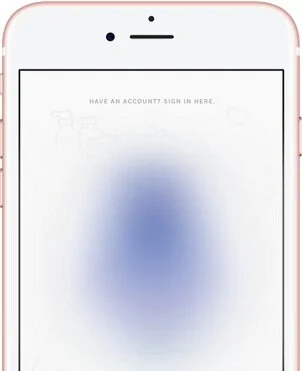
About Product X:
Product X is an iOS app that helps beauty consumers find hair products that will most likely work well for them. With the help of this expert system, consumers answer 4 questions via chat and are able to scan or search for hair products to receive personalized predictions (known as match scores) on their performance.
Background:
After testing the onboarding and recommendation screens, it was necessary to redesign the barcode scanner screen. Previously, it included an option to search for a product by name; however, it was proven easy to overlook during user testing.

The Project Details
Timeline: ~10 weeks (3-4 sprints); (designing wireframes specifically: <1 week)
Team: The Company X team consisted of a remote team of 3 people: myself, 1 in San Diego, CA, and 1 in Michigan. I worked closest with the Founder/CEO and the CTO/Head Developer
My Role: Director of UX: User Research, User Testing, UX Design
Tools Used: Sketch
Objective:
In order to create a barcode scanning screen that would be most successful, I took the following approach:
Research other apps with barcode scanning screens for inspo
Create wireframes for 3 versions of barcode scanning screen without the search option (to test the screen itself first)
Preference test wireframes
Add search feature to preference test winner
Test wireframe with new search feature
Note: During the middle of this sprint, the company pivoted — this project was put on pause in order to begin building a new one. Due to this, I was not able to complete the steps in my approach past establishing the preference test winner.
Solution:
Several apps, including Amazon, Think Dirty, and Shopwell served as inspiration for the 3 barcode scanner wireframe designs I created.
3 barcode scanner wireframe designs.
I added barcode imagery (I believed it would help to add visual aspect indicating that the barcode should be shown in the camera view, in addition to the text direction)
Brackets in on one design
Solid border on another design
Added a flash option to all — from inspiration; scans can’t be done in low light (edge case)
Additional Designs
During this process, I also designed the wireframe for the new score screen and missing product screen. However, no further action was taken on these designs due to a change in business goals shortly after their creation.
Inspiration for both screens came mainly from the Shopwell app.
Lessons Learned:
Providing multiple design options and leaving a major part of the decision to users/testers is helpful when incorporating design ideas from research and team members, especially when there are strong internal opinions.
Next Steps:
In order to determine which of the barcode scanner screens to move forward with, I set up a within-subjects preference test.
To learn more about the preference test and its results, please click here.