About Product X:
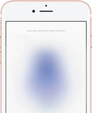
Product X is an iOS app that helps beauty consumers find hair products that will most likely work well for them. With the help of this expert system, consumers answer 4 questions via chat and are able to scan or search for hair products to receive personalized predictions (known as match scores) on their performance.
Background:
After pushing the last set of mobile app updates to production, the Costa Rica development team, with whom the Company X team had been working, reached the end of their contract’s term. At that point, we were joined by another team member who took over as the CTO and Head of Development at Company X. We began working with this individual to continue updating the mobile app.
With the test findings and major design recommendations in mind, the team concluded that it’d be best to redesign the mobile app. The goal was to incrementally release updates culminating in a complete redesign of the app, version 1.0 (v1.0). This page will focus on the version 0.2 (v0.2) iteration.
To learn more about the previous iteration, version 0.1.5, please click here.

The Project Details
Timeline: ~10 weeks (3-4 sprints)
Team: The Company X team consisted of a remote team of 3 people: myself, 1 in San Diego, CA, and 1 in Michigan. I worked closest with the Founder/CEO and the CTO/Head Developer
My Role: Director of UX (User Research, User Testing, UX Design)
Tools Used: Sketch, Asana, Draw.io, TestFlight, Marvel App
Objective:
With the breadth of information I was able to learn after conducting user research on the newly launched app, my team’s goal was to focus on the best way and time to apply the findings. Throughout the planning process of our first 2-week sprint, we kept our main business goals in mind:
Real-time data capture
Foster a community of consumers who are excited to continually provide information
Create and maintain valuable, pleasant experiences
By working with our new CTO, I got a clearer picture of the development efforts of many of my design recommendations. My team concluded that a few specific issues were most important to tackle upfront, which included:
Navigation design/information architecture
Our plan for revenue generation relied on users utilizing each app feature; I learned from testers that each feature was not easy to discover
Hair texture type answer choices
I learned that most testers did not know what term accurately describes their hair texture
High match recommendations feature
Remove and replace horizontal scroll
During testing, the ability to see that a section was scrollable horizontally (i.e., see the peeking element) varied widely for users depending on their mobile device
Barcode scanner screen design
(Pushed to be done after the first round of wireframe testing)
Solution:
Navigation design/information architecture
There was a huge need for user stories and flows in order to get my team on the same page. I created user stories and designed user flows, like the one shown below, for each process that we wanted users take.
I started by understanding and sketching out the flows as they currently were and updated those that needed adjustments for this iteration. Once I had an idea of how the flow needed to look, I digitized them for clarity and provided them to the CTO and the rest of the team.
Sketch of profile upload user flow.
Digitized profile upload user flow.
Because of the nature of most social media apps on the market, other barcode scanning apps, like Shopwell, and our need to make each major feature (especially those that were often overlooked during testing: Search, List, and Rate) visible to users, I sketched a new interface layout. Once the team decided on a layout to move forward with, I wireframed the new structure.
Wireframes with redesigned navigation.
Next, I sketched out and digitized a draft of the full information architecture as I hypothesized it to be to ensure that the team understood where different content would be found until more research was performed.
This sketch is slightly different from the final digitized version. Digitized version is not available.
Once I established an understanding of v0.2’s content layout (for the time being), I continued to design wireframes to help us achieve our objectives for this iteration.
Remove and Replace Horizontal Scroll
In order to make sure that all answer choices were visible for all mobile devices, it was clear that the answer choice layout needed to be adjusted.
Some users did not realize there were more answer choices and chose inaccurately and/or with dissatisfaction.
Using the Youper mobile app as inspiration, I designed the chat to show an answer prompt that users could interact with first before being shown all of the answer choices on the screen.
Interacting with the answer prompt or up arrows causes the answer field to expand, revealing all answer choices without relying on horizontally scrolling.
Hair texture type answer choices
It was very evident that even when users did see the additional answer choices using the horizontal scroll, they did not know which term accurately described their hair. Instead of using texture terms, I replaced the answer choices with images that most accurately reflected the terms and what we’d defined them to be.
Because multiple users expressed that they believed they had more than one hair texture, I designed the answer choices to be multiple selection. This allowed users to select up to 3 different textures. For each of the previous terms that we had before, I added 3 images that corresponded to the term, resulting in 18 texture images total (6 shown at one time).
High match recommendations feature
To keep users engaged, especially when their product inquiries produced low scores, it was clear that we needed to include a mechanism that provided recommendations. Unlike the other design updates in this iteration, this was a completely new feature. In order to do this, it was necessary to implement a score calibration for each user.
First, I created the user flow:
Then, I designed the calibration screen to function similarly to the existing rating screens since testers who interacted with the ratings had positive experiences.
Once the calibration screens were complete, I moved on to designing how recommendations would be displayed.
Using Amazon’s mobile app and the Shopwell mobile app as inspiration, I created a recommendations section that would live on the home screen of the app.
This screen provides users with product choices that fit into a regimen that works together to enhance product performance. Providing higher scoring products in this layout helps to educate consumers on what may work well for them in addition to the products that may work well together to achieve their desired outcome.
Other Design Updates (Low-Hanging Fruit)
Additional Questions
Since it is imperative that users trust Product X and the performance predictions (i.e., match scores) that it provides, the Company X team decided that it’d be best to include a few additional questions during the onboarding chat. During testing, when participants mentioned wanting to answer more questions, I took note of the additional questions they expected. Several of the questions participants mentioned were adapted, increasing the number of questions from 4 to 10.
It was later determined that additional questions would need to be pushed to a future update.
Profile Changes
Most testers were hesitant and even unhappy about providing a profile picture. In v0.1.5, although providing a profile picture is optional, users did not seem to notice. Instead of giving users an option to upload a photo, I restructured the profile screen to focus more on the users’ hair profile.
The main inspiration for the new design came from the Shopwell and Facebook profile screens.
To ensure that these profile screen changes were understandable, I guerrilla tested the screen in a local Starbucks in Los Angeles, CA. During the guerrilla testing, I asked 7 female participants how they would go about editing the first and second profile categories. 5 out of the 7 participants described and edited the profile selection with ease.
I chose to do guerrilla testing for this screen because it was the only screen that I believed was able to stand alone and still make sense to participants without requiring a time-consuming introduction or backstory.
wireframe Prototype
In order to find out if the wireframes made sense to others, I created a prototype of the screens using Marvel App. Once complete, I set up a testing area in the Vector90 co-working space in Los Angeles in order to conduct user testing sessions to evaluate the usability of the remaining, newly designed wireframes. Click here to view the prototype that was tested.
Lessons Learned:
User flows are most helpful when broken up into specific actions or processes; explaining the events of a feature bit by bit was more clear for my team and easier to digest
User flows, although useful, may not always communicate clearly; utilizing screen flows is more helpful at times since they involve the visual aspect of the user’s interaction with the [wireframe] screen
Redesigning an entire app should be tackled in steps, especially when working in an agile environment — communication with development is essential to understand what’s feasible in a certain amount of time
Next Steps (Future Iterations):
Test prototype with users
Capture feedback and incorporate any needed adjustments
Test any incorporated changes
To learn more about the wireframe prototype user tests, please click here.