
About Product Y:
Product Y is a Shopify app that helps to educate consumers about the hair products on a merchant’s website. Shoppers can interact with Product Y directly on the merchant’s product page. After a quick conversation, they receive a match score which informs them of how well the merchant’s product(s) is predicted to perform on their hair. Also within the app, is an admin panel that Shopify merchants use to view app activity and manage Product Y on their site.
Essentially, Product Y provides the experience of the Product X mobile app on e-commerce platforms.
Background:
After conducting user tests and obtaining feedback on the wireframes of the consumer experience with Product Y, I needed to incorporate the most important input we received into the design. Once complete, I needed to create the high-fidelity mockups as well since we did not have a dedicated UI designer on the team.
Additionally, the merchant admin panel needed to be designed. Based off Shopify app research, the Founder/CEO’s knowledge of the industry, and my conversations with Shopify merchants, I began creating the first iteration of the admin panel design using Polaris (Shopify’s design system). This page will focus on the updated consumer experience and the admin panel design processes.

The Project Details
Timeline: ~6.5 months; (wireframe update/mockup design, & admin panel specifically: ~6 weeks)
Team: The Company X team consisted of a remote team of 4 people: myself, 1 in San Diego, CA, and 2 contracted developers (1 in Canada and 1 in Peru). I worked closest with the Founder/CEO
My Role: Director of UX (User Research, User Testing, UX, UI, IxD, Product Designer, Product Manager)
Tools Used: Sketch, Polaris (Shopify Design System), Plant, InVision
Objective:
I needed to make necessary adjustments for the second iteration of the consumer experience wireframes. The changes made were centered around addressing major issues discovered during user testing. Below are 3 examples of the main things that were addressed:
Participants expected to see information that described what the score meant in the score details description; the majority of participants wanted this information displayed visually, with some stating that they’d prefer both words and a graphic
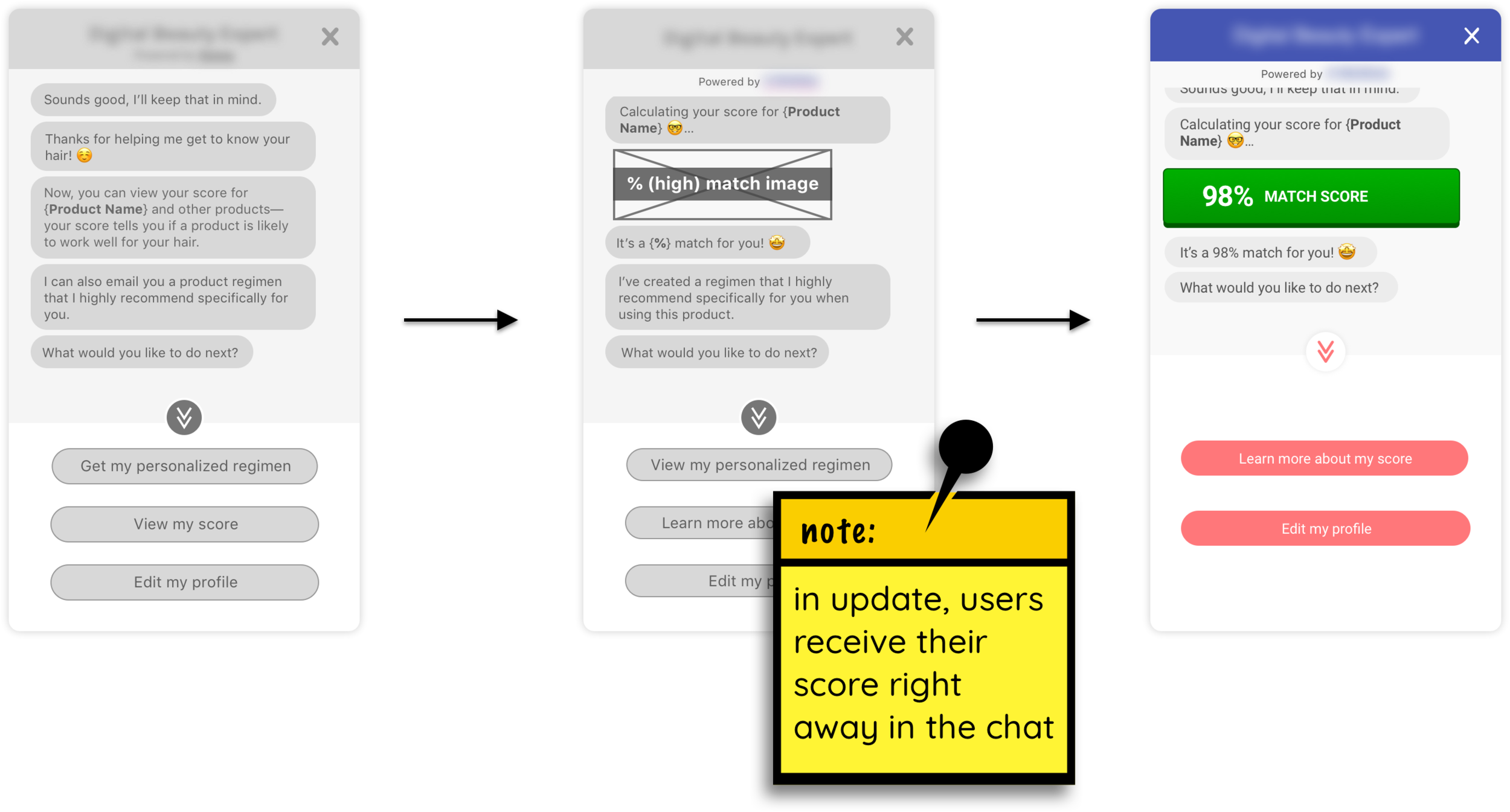
Many participants mentioned wanting to know their score right away without having to take action to see it
The participants who encountered the low match score screen desired to see recommendations of other products on the site that had higher scores
In addition to the consumer experience, I needed to begin designing the first iteration of the admin panel for merchants.
My approach was as follows:
Conduct research using: Shopify partners blog, Shopify forum, Shopify apps, Shopify help documentation, team knowledge
Apply the research to: user stories, user flows
Design using the Polaris design system
Obtain feedback
Iterate
From conversations with Shopify merchants, research and discussions with the Company X Founder/CEO, we determined that it would be most important to include the following:
Dashboard screen
Analytics/Insights screen
Help/FAQ screen
Edit widget screen
Solution:
Consumer Experience Design Update
Participants expected to see information that described what the score meant in the score details description; the majority of participants wanted this information displayed visually, with some stating that they’d prefer both words and a graphic
The participants who encountered the low match score screen desired to see recommendations of other products on the site that had higher scores
The score screen from the first iteration did not include any visual representation of the information described in the score details description.
Medium-fidelity wireframes and high-fidelity mockups of the updated score screen (mobile and desktop).
The updated screen includes a visual explanation of which profile characteristics match/do not match the product in question. Here, users are also provided with recommendations for different products to encourage additional browsing and possible upselling when they receive a high match score and to provide higher-scoring options when they receive a low match score.
*Due to technical constraints, the brief description summary of the score needed to be tabled for this version (the description was left out of the updated design)*
Seeing Scores immediately
Many participants mentioned wanting to know their score right away without having to take action to see it. Instead of requiring participants to take an extra step to see their match score, the updated iteration notifies users of their match score during the chat portion of the user’s experience. They now have the option of learning more about their match score after knowing what it is.
Admin Panel Designs
To start creating the admin panel design, I needed to get a general idea of what it should entail — which I got from both discussing requirements with my team and researching information and existing apps on the Shopify platform.
Once I had that general idea, I needed to lay out what merchants (i.e., the users) needed to be able to do on our platform specifically and how they’d do it. To do this, I created the user stories, user flows and rough sketches of the main screens.
User flow draft sketch.
Main screen draft sketches.
By using Shopify’s design system, Polaris, Shopify Partners are said to save time on design and coding. My decisions regarding the admin panel design:
I chose to use Polaris almost exclusively throughout the entire admin panel design because:
Polaris components are tested and updated by Shopify regularly
Helps design and development to be consistent
Helps design and development to work faster; my team strove to maintain a fast speed during this project
I also chose to design the admin panel as an embedded app (i.e., a Shopify app’s admin panel that is embedded into Shopify’s admin platform) because it helps to maintain the same UX that the merchants already experience while using Shopify
This requires less time for merchant to adapt to the new product
After deciding to use Polaris and design as an embedded app, I designed the first iteration of the onboarding and admin panel screens.
I used other Shopify and third party Shopify apps, like Bold Brain, Product Reviews, and Smile.io, as inspiration.
Dashboard design using Polaris.
FAQ help screen design using Polaris.
Lessons Learned:
Time plays a major factor in completing projects in a startup atmosphere (i.e., the faster, the better). While working in an agile environment, it was tough for me to maintain my design process at times as there were some things that I did and did not do that I would not have/would have done if time (and resources) permitted. Things such as:
Re-tested the updated consumer experience wireframes
Created detailed wireframes of the admin panel and tested/requested feedback on the designs before jumping into using Polaris to create the high-fidelity mockups
Tested/requested (and received) feedback on the admin panel from more merchants in general
Next Steps:
After designing the admin panel screens, I needed to know what merchants thought was most important out of what we were providing and if the information was easy to understand and access, especially since many merchants were not very technically savvy.
To continue learning about how I discovered what mattered most to merchants, please click here.