Intro to Glucostabilizer:
Working with patients who are diabetic is the responsibility of several healthcare professionals, including the client who requested a user interface redesign of this product. This client was a healthcare facility that utilized a centralized notification system. As it existed, the system was difficult to read, outdated, not very user friendly, and did not provide all of the functionality needed.
Background:
The human factors engineering team I was part of was tasked with creating several different designs to present to a healthcare client.
This project was completed as an assignment for the Applied Human Factors Engineering course in the Accelerated Master's Program in Systems Engineering at the University of Virginia in 2014.

The Project Details
Timeline: ~2 weeks
Team: The GlucoStabilizer team was composed of 4 people
My Role: Systems Engineer, UX, UI
Tools Used: Sketch, Photoshop, Powerpoint
Objective:
The hospital came to us with the existing interface for stabilizing patient blood glucose while in the hospital, shown below. They feared that the display and control of information with the interface was leading to operator confusion and user error. The control of blood glucose is vital to patient health and recovery, and inaccurate control can quickly lead to patient death. Our task was to offer redesign alternatives (i.e., mockups) to the client.
Because I, nor my team members, were experts in the healthcare field, information gathered from the client was critical to the design. Below is the list of our client’s top priorities. In order to be successful, I found that I needed to ensure the focus was on the following items when designing the new system:
Name of patient
When the next blood glucose test needs to be conducted
Blood glucose levels (in or out of range)
Method of calculating insulin dose, based on blood glucose
Reduce risk of errors
In addition to our client’s priorities, I was also provided with information regarding blood glucose levels as well as general glucose control system information. This information was important to keep in mind when re-designing the current system; it allowed for a better understanding of when nurses need to be alerted, how frequent ICU glucose monitoring occurs, and what nurses are responsible for tracking/controlling.
Solution:
Design Justification
For the design, I wanted to ensure that the monitor/display on each device was both intuitive and concise for the nurses. To accomplish this, I brainstormed with my team to come up with the critical criteria (listed below) to use as design guiding principles:
Easy/quick to read for nurses
Timer and name of patients largest/boldest item on screen
Streamlines nurse transition/shift change process
Patient buttons for quick drill down on individual patient
Minimize enclosures to ensure screen isn’t distracting and doesn’t cause eye strain
Color scheme increases readability:
Contrast bold text directs attention to most important information
Stop light approach provides intuitive usability
Blood glucose trend information prominent for easy viewing
The Redesign
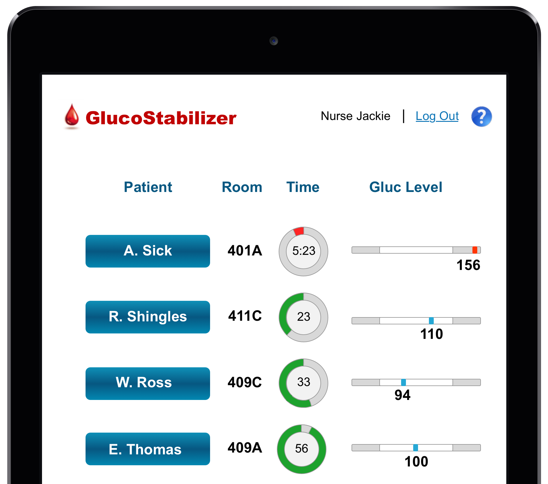
The user interface redesign proposed are for designs on large screens, mobile tablets, and desktop computers.
Large Display Monitor
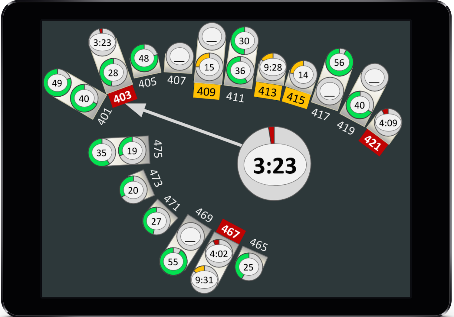
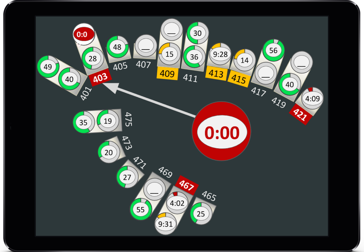
To increase awareness for all nurses, I decided to design for a large display (~52inch monitor) that would be mounted within the nurse station area that provides an aggregate view of the entire ICU. This display shows the layout of the unit, which rooms currently have patients in them, the number of patients in each room, and the time remaining until a patient is in need of a glucose screening.
Mobile Device
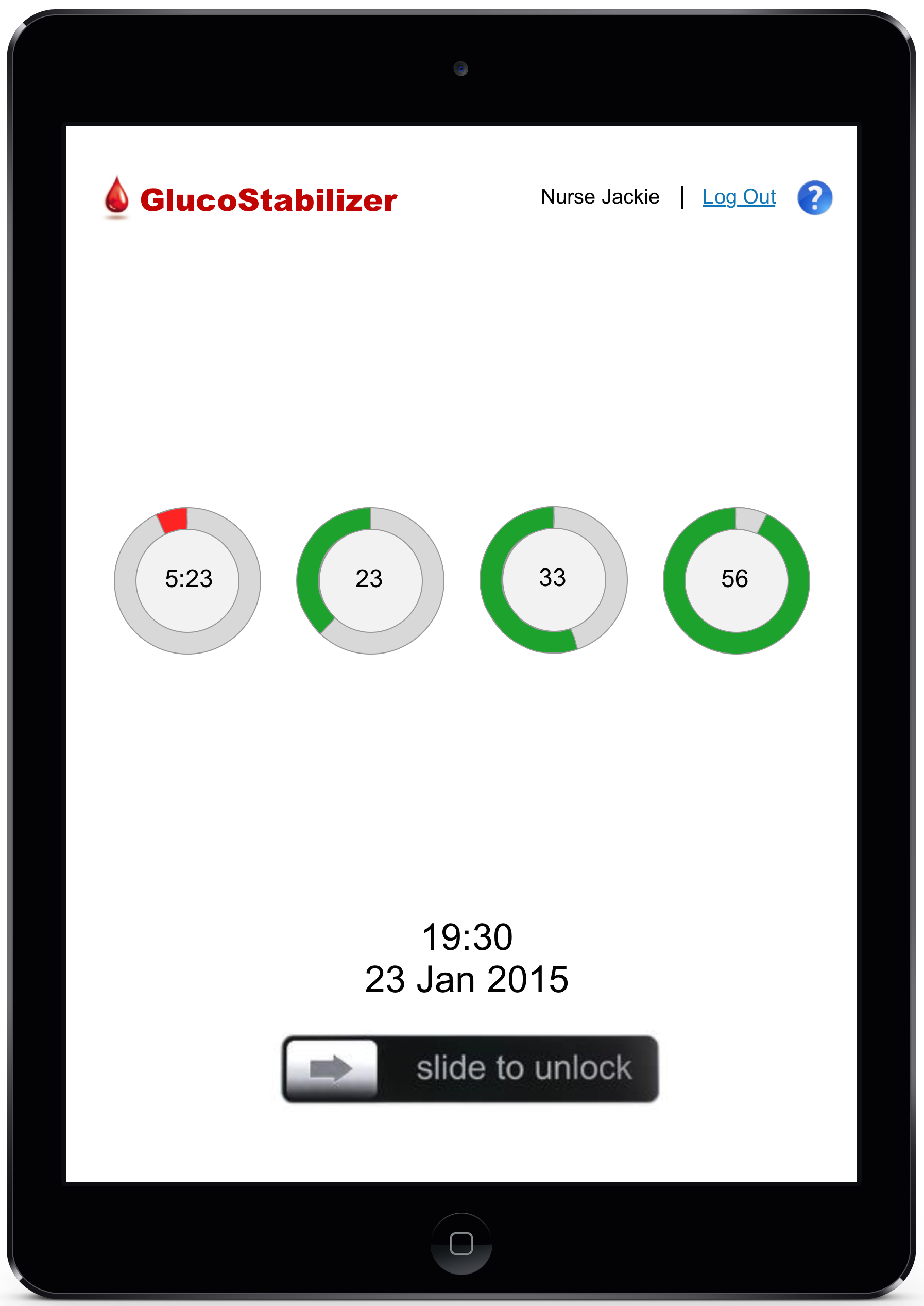
In order to increase the efficiency and effectiveness of each nurse, I determined that a handheld device should be designed. I decided on an electronic tablet device because not only is it convenient due to its size, but it also has a connection capability that links the device to the nurses station as well as to each patient's room.
To ensure the safety and security of patient information, I designed a login system that restricts the usage of each tablet to the individual user — one nurse per tablet.
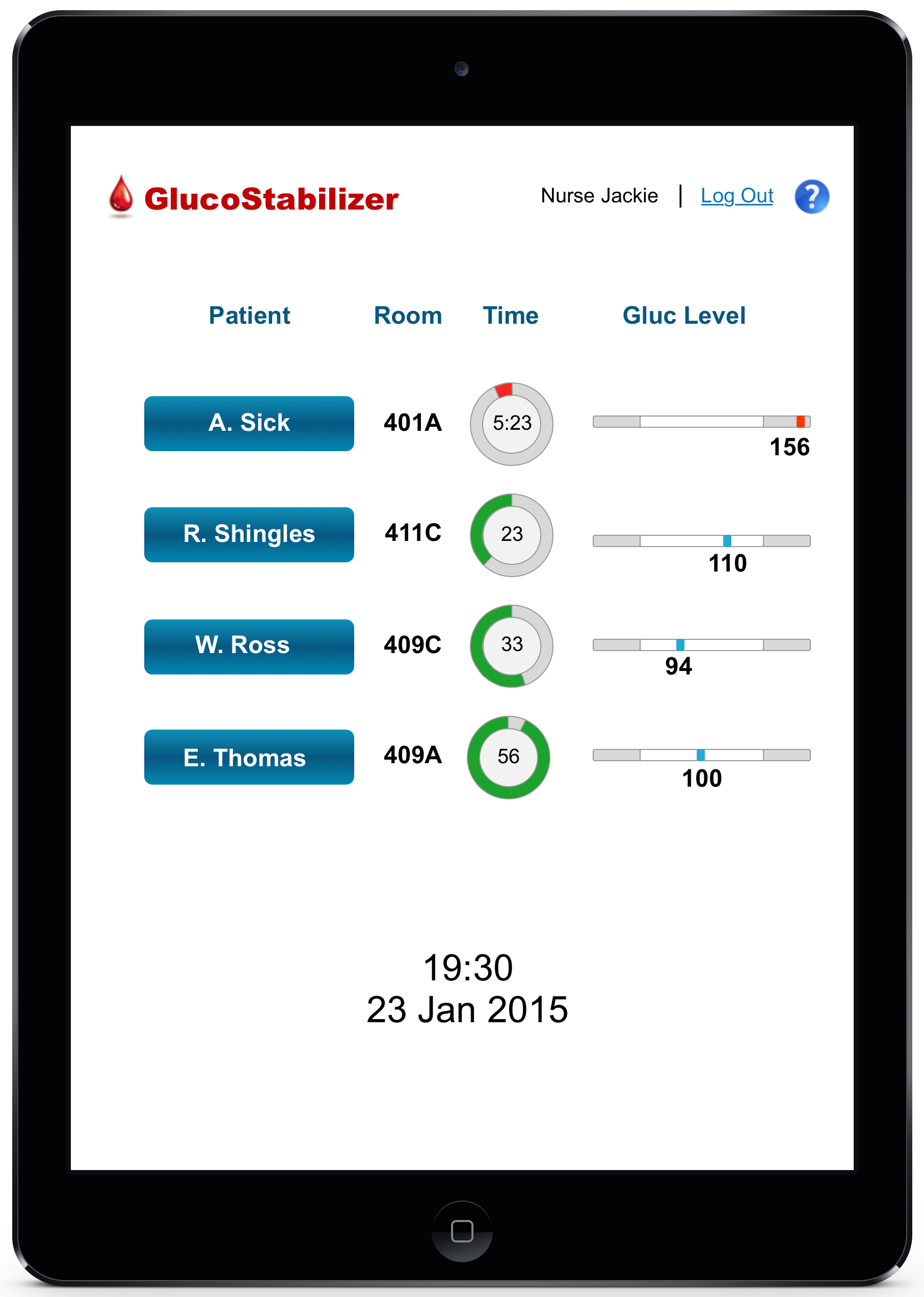
Desktop/Laptop
To make certain each patient received the proper glucose treatment, I redesigned the bedside laptop located in each patient’s room.
For this design, it was imperative that all of the vital information was available immediately upon login. It was also important that the display was intuitive to nurses and that it provided the checks and authorizations necessary to avoid errors and mistakes.
Design Tradeoffs:
There were a number trade-offs that were taken into account during the creation of this design. The design trade-offs for each design can be found below.
Large Display Monitor
Only current data is shown on aggregate
Traffic light-like indicators of time remaining may not be optimal for nurses who may be colorblind
To allow a more clear and simple view of the patient status, all other data is left off (to be seen on handheld/patient room devices)
Mapping of rooms and hallway are altered in order to fit comfortably on large display
Darker display may be harder on eyes in brightly lit areas
Mobile Device
Light colored background is neutral, but consumes more power
May not be optimal to view in dimly lit areas (eye strain)
Desktop/Laptop
More energy consumption when on lighter colored background
Blood glucose drip rate requires manual entry (cognitive decision) rather than quick-click choice
Alarms
Visual and tactile alarms instead of auditory