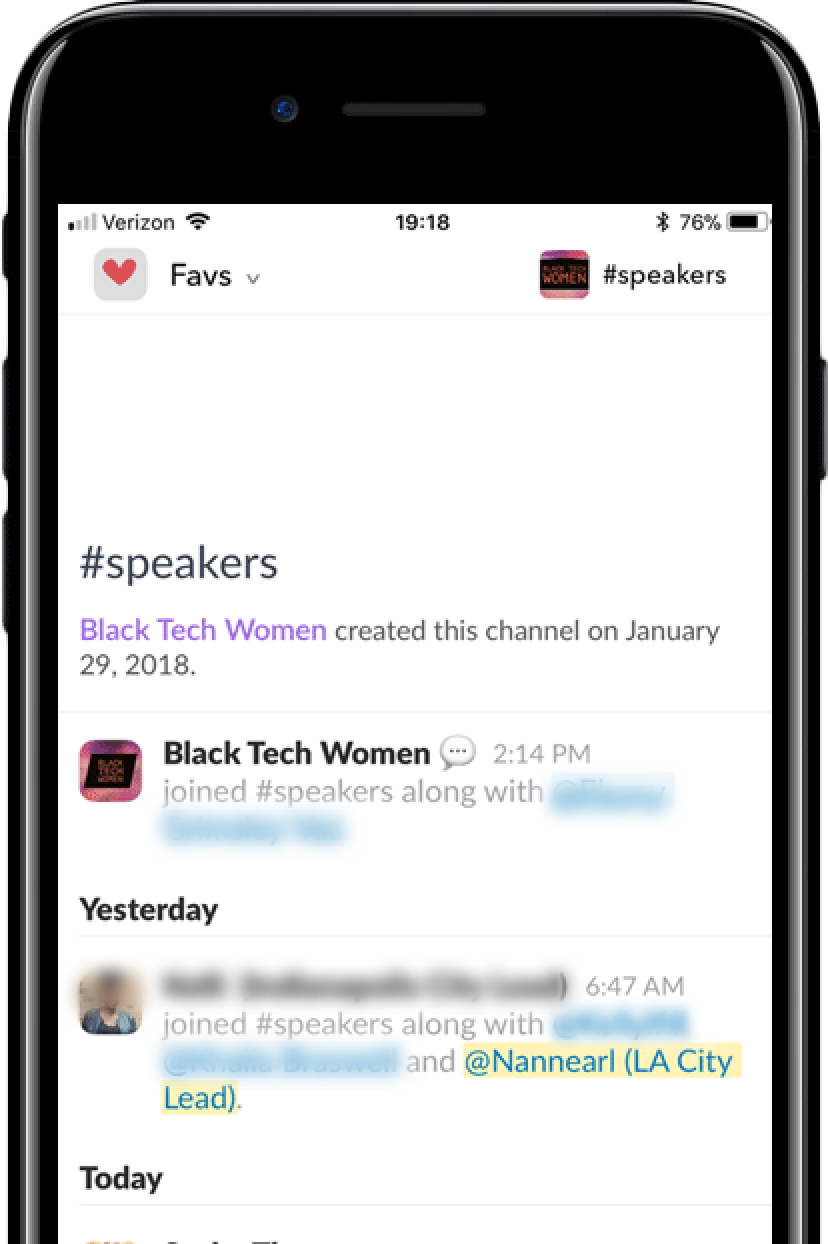
Intro to Favs View:
Slack can be a very effective and useful tool for communication amongst professionals. Because of Slack's ease of use and various features, it has quickly gained popularity within other professional and social groups outside of the office. People often find themselves belonging to more than one group, or workspace, on Slack — and within these workspaces, they are likely to be involved in multiple channels. Staying engaged and keeping track of important conversations in each channel a user belongs to can be a tricky task. The Favs View provides a central place where users can see the conversations that mean the most to them.
Background:
This project was completed as a part of my application to the 2018 KPCB Design Fellows Program.

The Project Details
Timeline: <1 week
Team: This was a solo project
My Role: UX, UI
Tools Used: Sketch, Photoshop, InVision
Objective:
Slack keeps its users connected via groups (i.e., workspaces) and channels within these groups. Normally, channels are created categorically (e.g., by interest, task, roles, etc.) and users can join multiple channels within the workspace to which they belong. The major trade-off of maintaining constant communication with multiple contacts in Slack is that users have to navigate to the specific workspace in which a particular conversation has occurred. This can be somewhat task heavy on both the web and mobile applications, especially if a user belongs to a large number of channels within different workspaces.
In the desktop app, the workspaces are listed on the left by each group's icon. If a user belongs to several workspaces, they have to select the workspace in order to see the communication that takes place within each workspace's active channel.
Within workspaces, users must navigate between channels to communicate. In the mobile app, users must select the workspace they desire and are required to swipe (left or right) in order to select different channels in which they wish to communicate.
user feedback:
When selecting the appropriate name for this feature, I wanted something simple, short, catchy, and clear in regard to the feature's actual function. "Favorites" is a common term when referring to what a user likes or wants to see the most, so that was the obvious choice. I chose the abbreviated version of the word; however, both "fave" and "fav" are both considered abbreviations for "favorite."
In order to learn what would be most useful and recognizable to users, I prompted my social media network on Facebook, Instagram, and Twitter with a poll asking what they believed the correct spelling of the abbreviation to be. After one week, 70% of 76 voters on Facebook replied in favor of "fav," 65% of 49 voters on Instagram replied in favor of "fav," and 55% of 11 voters on Twitter were also in favor of "fav." Based off this data, I determined "Favs View" to be the better option.
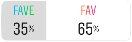
Instagram poll results to the prompt: "What is the correct spelling of the abbreviation for 'favorite?’”
When considering which platform to design for, I decided that it would be helpful to design for both the mobile and desktop app since the same task-heavy problem exists on both applications. I wanted to create something virtually seamless in regard to the design that already exists while simultaneously distinguishing the feature as something that is unlike a traditional workspace — that way, the feature could stand out while still appearing like it is a natural part of the application. I applied this thinking to both the feature's design and functionality.
Solution:
I began the redesign process by creating low-fidelity wireframes by hand for both the desktop and mobile applications. After designing the wireframes, I designed the desktop and mobile high-fidelity mockups using Sketch and created clickable design prototypes using InVision.
For both the desktop and mobile app, I chose to treat the Favs View as if it were a primary workspace within the workspace panel. Each Slack user starts with a Favs View that is empty and in need of configuring. To configure the Favs View, the user is prompted to select the specific workspace and channel that they want to add. In this design, the user is able to select up to four views. The process of configuration (of one view) will take users five touches/clicks to complete. After configuration of one view is complete, the user is taken to their newly created Favs View screen where they have the option of creating additional views in addition to editing or deleting existing views.
Low-fidelity wireframes of desktop and mobile applications.
Desktop App
Favs View icon sits separately at the bottom of the workspaces panel to distinguish it from the rest. The icon is fixed in position, so upon decreasing the length of the application, the Favs View overlays other workspaces and remains visible in the bottom-right corner.
The actual view of the Favs View screen is designed to allow users to send and receive messages within the favorite channels from one location. This way, users are not forced to navigate through different workspaces to get to channels that they prefer to keep a closer eye on.
The primary user flow for this feature can be seen in the prototype recording below:
Mobile App
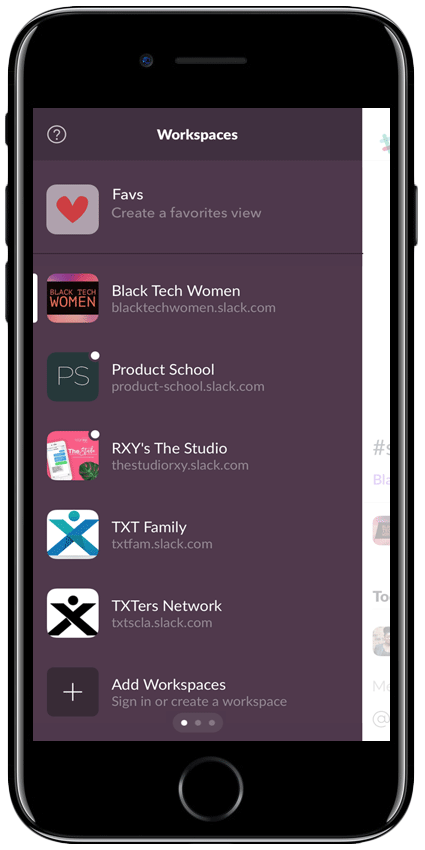
For mobile, the Favs View icon is fixed at the top of the workspace panel and exhibits the same behavior found in the desktop application. With the icon at the top, it is noticeable and provides easy access to the feature. As shown in the mobile app prototype recording below, creating a Favs View is just as simple as it is on the desktop app.
Assumptions & open issues:
There are several assumptions that were made during the process of this redesign. I understand that if the assumptions made (listed below) are not true, then it can have a detrimental effect on the success of the Favs View feature. There are also a number of open issues that would need to be addressed in order to facilitate the completion, build, and adoption of the redesign.
Assumptions
Belonging to multiple workspaces/channels is common for most Slack users
Communicating via several channels is bothersome to a significant amount of users
Open Issues
Unsure of any usability requirements
Unsure of Slack's financial information and the financial constraints that are present
Unsure of design team's constraints
Ignorant of Slack's project roadmap
Unsure if this redesign can translate to increased revenue for Slack
Social media poll data was not able to be closely examined; therefore, some participants from one social media platform may have voted on the other platforms, resulting in their input being counted more than once